
2026 Emerging Young Artists
We Hold These Truths is the 22nd exhibit presented as part of the Access/VSA Emerging Young Artists Program, a Jean Kennedy Smith Arts and Disability Program. This national art career development program and exhibition features fifteen artists with disabilities, ages 16-25. Each artist’s unique individual talent, mode of expression, and view of the world is highlighted and valued. With this exhibition, we aim to amplify the work of artists with disabilities throughout the United States, positioning them to broaden our understanding of disability and the arts.
This year’s theme, We Hold These Truths, invites artists to explore how the truths that they hold dear engage with their disability and artistic identities. We hope that as you view the work and learn more about these incredible young artists you are inspired to consider what personal truths ring most true to you in this historic moment marking the United States’ 250th anniversary.
ABOUT ACCESS/VSA EMERGING YOUNG ARTISTS PROGRAM
Our programs for artists with disabilities shape the future of the arts. The Access/VSA Emerging Young Artists Program amplifies the voices of emerging visual artists through career development and professional empowerment.
This national juried exhibition seeks artwork that demonstrates the excellence and important perspectives of artists with disabilities, ages 16-25, residing in the United States. Fifteen artists each receive a $3,000 financial stipend, engage in professional development activities, and have their submitted work featured in an exhibition. Learn more at kennedy-center.org/emergingyoungartists
The content of this program was developed under grant H421F240164 from the U.S. Department of Education (Department). The Department does not mandate or prescribe practices, models, or other activities described or discussed in this program. The content of this program may contain examples of, adaptations of, and links to resources created and maintained by another public or private organization. The Department does not control or guarantee the accuracy, relevance, timeliness, or completeness of this outside information. The content of this program does not necessarily represent the policy of the Department. This program is not intended to represent the views or policy of or be an endorsement of any views expressed or materials provided by any Federal agency (EDGAR 75.620).

See the Exhibition
Hall of Nations | 2700 F Street NW, Washington, D.C.
March 13 - April 26, 2026
10:00am - 11:00pm
FREE | Open to the public

Anika Brown
Utah · Age 25
Biography: Anika Brown addresses disability and pain in her oil paintings and mixed media installations. She draws from her experience with chronic illness and her recovery following a brain surgery in 2019. In her work Benign, Anika has used EEG wires to contrast against fragile, semi- transparent portraits. Reminiscent of pinned butterflies, over 100 nails are shoved through the faces. In this way, she studies the contrast between internal and external experiences in the body. She hopes that her work can create a sense of community and understanding. Anika has a bachelor’s degree in Fine Art from Brigham Young University. She is currently based in Utah.
Artist Statement: I am a painter who explores the vulnerability, grief, and hope associated with chronic pain. Disability is isolating. For those who experience this pain, I hope they see my art and feel seen in return. But even those without debilitating conditions will experience pain. All of us will feel grief as our bodies age and change. In this way, I hope everyone can recognize themselves in my art.
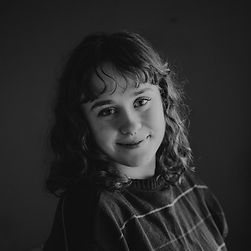
Headshot photo by Anika Brown

Benign (2023)
graphite, EEG wires, nails
24" x 42" x .25"
Artwork Image Description: Anika Brown’s piece Benign from 2023 is made up of three nearly square sheets of translucent/tracing** paper that overlap to create a diagonal that moves to the right and down. Three faces are drawn on the sheets with smoky, ghostly shading. All three have their lips parted and their left hands, to our right, folded in loose fists by those cheeks. They all also look off to our right. The leftmost cuts their eyes sharply to one side as they lift their chin. The central person tips their head to our right as they look off in that direction, and the third looks down with eyes hooded or perhaps closed. Blue and red wires ending in thin connectors dance on and around the contours of the figures’ faces. The other end of the wires, the tiny electrodes, are concentrated along the top of all three heads. Dozens of nails pin the wires and papers in place. Touches of bright gold line the lips of the first and third figures, the eyebrows of all three, the eye sockets of the middle figure, and the contours of the leftmost neck. The space encompassed by all three sheets and the wires measures 2 feet high by more than 3 and a half feet across, the size of a small windshield.

Catie Cook
Missouri · Age 24
Biography: Catie Cook is a figurative oil painter raised in Gainesville, GA. She holds a Bachelor of Fine Arts degree from The University of Georgia with an emphasis in painting, art history, and museum studies, and a Master of Fine Arts from the Sam Fox School of Design & Visual Arts in St. Louis, Missouri. Cook's work has been exhibited across the east coast and the midwest including at Future Fair in New York City, The Kemper Art Museum in Saint Louis, and The New York Academy of Art, in New York City. Professionally, Cook is a Part-time Lecturer in the Painting Department at WashU’s Sam Fox School. She has worked as a mural painter for Color The World Bright and as a member of the Director's Advisory Committee for The Mildred Lane Kemper Art Museum. Notably, Cook’s master copy of Van Gogh’s Stairway at Auvers, created for programing for visually impaired museum guests, is a part of the Education Department’s collection at The Saint Louis Art Museum. She is a Recipient of the The Laura and William Jens Scholarship at Washington University in St. Louis, and was awarded the 2025 Graduate Thesis Production Grant.
Artist Statement: Inspired by my upbringing in the American South, surrounded by the pageantry of the church, debutante culture, and beauty pageants, my paintings harness the symbol of the stage as a metaphor for the performativity of gender. In my theatrical oil paintings, alluring imagery of lush curtains and white fur beckon the viewer into an uncanny narrative. The Dalmatian, a recurring character in my paintings, explores the parallel performances of beauty between show dogs and southern women. As my dogs snarl, pose, and leap across staged scenes reminiscent of the theatre, I weave uncanny narratives wrought with themes of control, beauty, and artifice, questioning the ways in which our patriarchal society demands performance and perfection. As the daughter of a scenic designer, I am drawn to the language of theatre —idealized imagery and carefully constructed scenes that, though imitating reality, often feel eerie and artificial. Through the strangeness of a drape of fabric or illusion of stage lighting, there is a lingering reminder that my characters are performing for your gaze — a feeling emblematic of the female experience. Ultimately my work examines the antithetical nature of girlhood and asks the viewer to consider whether there can be room for both celebration and critique of femininity.
Headshot photo by Caitlin Custer

Bred To Be Beautiful (2024)
oil on canvas
64" x 54" x 1.5"
Artwork Image Description: Catie Cook’s painting Bred To Be Beautiful from 2024 measures 64 inches high (so almost 5 and a half feet) by 4 and a half feet across. Two dogs, both Dalmatians, leap across the bottom half of the composition in front of an emerald-green curtain. The left side curtain is tied partially back with a pine-green cord. The right curtain curves down into view only in the top right corner, and the space between is filled with another curtain of the same color. Light gleams off the fabric, creating the impression of a sheen. Both dogs are mostly white with blot-like black spots, and their ears flap loosely in mid-motion. Their long-muzzled faces turn toward us as their bodies move to our left. The Dalmatian to the left rounds its back with head low as it jumps with its back paws on the stage and the front legs arced over and off the stage into the lower left corner of the painting. The dog on the right tucks the front elbows in by its body as it lifts the torso high on its back legs.
Cora Feist
Minnesota · Age 21
Biography: Cora Feist has always had a keen eye for capturing the soul of her subjects. Currently based in Minneapolis and studying for her BFA degree, she has a fixation on color and acrylic painting. She typically starts her pieces with a vivid base color and works in layers to slowly develop the image. With this approach, every brush stroke contributes to the depth and complexity of the final painting. The semi-transparent quality of each layer allows the previous ones to shine through, often leaving hints of the base color peeking out as well. The glow this process creates contributes heavily to the near dream-like quality of Cora’s work. With her studies, she hopes to refine this technique and hone her artistic voice until it speaks all on its own.
Artist Statement: I live, breathe, and love art, more than anything. I’ve been drawing longer than I can remember and, since my youth, my mind has been teeming with possibilities. This constant flow of ideas always felt like an endless well of inspiration, until it seemed more so like another sign of ADHD. I’ve learned to accept the persistence of my thoughts as being both a blessing and inhibition at the same time. I often find myself moving from project to project faster than I can complete them. For personal work, this never bothered me much, as I know my best ideas are always the ones that I’ll come back to. However, when working on commissioned work, it makes the process quite disheartening. Without much spare time left for me to create in a day, I often end up feeling depressed when I’m obligated to create things that are intended to generate profit for businesses. The Sign Painter was my way of processing these conflicting feelings that arise when having to balance both your passion and profession together as one. These incredibly heavy and complex emotions that stem from life under capitalism, and all those other feelings that are too nuanced for simple discussion, are what I am most driven to capture within my work.
Headshot photo by Morgan Converse, Converse Candids Photography

The Sign Painter (2025)
acrylic on paper
20" x 16"
Artwork Image Description: A person looks over their left shoulder at us while holding a marker up to a piece of paper in this acrylic painting on paper. The Sign Painter was created in 2025 by Cora Feist, and it measures 20 x 16 inches, so just over 1 and a half feet by almost 2 feet. The person has light-toned skin with chin-length, curly brown hair and bangs sweeping across the forehead. Dark eyes cut back to look at us. The far hand holds a blue marker up to a sign decorated in red, black, and blue that reads, “3 topping New York only $10.99.” The person finishes coloring the 0 of the ten. Below the price are close-ups of pizza slices being pulled apart. A blue placard with a white wheelchair symbol hangs between the sign and a red door with a metal handle, to our right. The sheet hangs from two binder clips along the top edge, and the paper is signed “Cora Feist ‘25” in the lower right corner.

Emerson Buffalow
Pennsylvania · Age 23
Biography: Emerson Buffalow is a multidisciplinary artist whose work centers around the hidden infrastructures of the fashion industry. Her work develops from interdisciplinary experiences during her time at Franklin & Marshall College. A bachelor's degree in psychology, environmental studies, and studio art combined to shape a critical practice grounded in human behavior, ecological systems, and material experimentation. Her work has been selected and featured in Franklin & Marshall College’s 2023 and 2024 Winter72 Art Show and in Franklin & Marshall College’s 2024 Senior Capstone Exhibition, beyond the frame.
Artist Statement: I use discarded clothing and accessories in my work to question the sustainability of the fashion industry. My work is an examination of humans' rejected items and how to give them new life. Doing so goes against the typical dynamic of our disposable society. Addressing sustainability conceptually and physically, my work retains items’ original construction to engage viewers with familiar objects or deconstructs them to question production, fashion, and consumerism. My ideas often originate from lived experience and pop culture, including sayings, books, and music, which I use to draw viewers in before adding underlying meaning through form and material. While my projects begin with intention, the process frequently becomes improvisational as materials respond dynamically. In American Dream, I used a discarded pair of U.S. Polo Association jeans to juxtapose the brand’s American identity and their outsourcing of garment production.
Headshot photo by Joe Kelly

American Dream (2024)
silkscreen print and embroidery on denim
23.5" x 35" x 0.25"
Artwork Image Description: One leg of a pair of dark-wash denim jeans is splayed open and printed with an American flag in American Dream, a piece made in 2024 by Emerson Buffalow. The work measures 2 feet high by almost 3 feet across. The artist took the left leg of the pants and split the inner seam so the side pocket and dark outline where the back pocket had been flank the side seam. The piece is affixed to the wall so the waist is to our left, and the bottom hem is to our right. The edges are frayed, and four silver-headed fasteners, perhaps nail heads, are spaced along the top edge. The leather tag for U.S. Polo Association is stitched to the waistband, and a second tag bearing the same name is stitched near the crotch of the jeans near the bottom left. The American flag reaches from the bottom of the back pocket almost to the bottom hem of the pant leg, and it is printed so the color of the jeans create the blue behind the stars. The removed pocket, also with the U.S. Polo Association logo, has been restitched onto the piece near the bottom of the leg, in what is now the top right corner of the piece. Words in white text reading “Made in Mauritius” in all capital letters are screenprinted under the flag near the lower right corner.

Erin Grimshaw
Utah · Age 18
Biography: Erin Grimshaw is a visual artist who primarily works in colored pencil, with occasional use of other mediums. Her work often reflects personal experiences and focuses on themes of identity, growth, and resilience.Diagnosed with a learning disability at a young age, Erin grew up navigating academic challenges that were not always visible to others. Art became a space where she felt capable and in control. What started as doodling during class became a meaningful way to express herself without the pressure of grades or performance. Erin plans to pursue a career in art therapy and hopes to work in a children’s hospital, helping young patients use creativity as a way to process and express their emotions.
Artist Statement: My piece is a watercolor painting of my eye as a young child, layered with the repeated words “She’ll be fine.” This phrase represents what my mom was told when I was diagnosed with a learning disability. It was meant to be reassuring, but it also carried uncertainty about what that would actually mean for me. Growing up with an invisible disability shaped my experience in school. Many of my challenges were not obvious, but they affected my confidence and how I saw myself academically. Art became a place where I did not feel defined by what I struggled with. It was something I could do freely and confidently. Although I primarily work in colored pencil, I chose watercolor for this piece because of how it layers and blends. The softness of the medium allowed the text and image to interact in a way that feels subtle but intentional.
Headshot photo by Camille Grimshaw

She’ll Be Fine (2025)
watercolor
11" x 14" x 1"
Artwork Image Description: The eye and part of a person’s cheek fill this watercolor painting, which measures 11 by 14 inches. The work is titled She’ll be Fine and was created by Erin Grimshaw in 2025. This is a close-up view of the person’s left eye, which is rimmed with long, dark brown lashes. The iris is mostly brown with touches of jade green on the right half and golden umber on the left. Two white catch lights gleam over the dark pupil. The skin is painted with peach tones above the eye, which fade to white over the cheekbone before edging to pink along the bottom of the page. To our right, dark hair painted with tones of coffee brown and plum purple near the eye transitions to jewel-toned blue in the lower right corner. Cursive text written in gray watercolor repats across the cheek and over the temple, reading “She’ll be fine.”

Giusiana Prosser
Washington · Age 22
Biography: Giusiana Prosser explores the depth of the reality of life-altering illness with her work. As a multimedia artist working primarily in acrylic, each brushstroke is intentional. She uses deep blues and gray hues, translating fatigue, resilience, and loss into a visual form. Her work articulates physical grief and persistent pain into composed, immersive pieces that invite contemplation. Alongside her art, she is active in the medical advocacy community, where she combines storytelling, visual work, and public outreach to support patients, reform care, and advocate for ongoing patient-centered policy change efforts. Giusiana’s commitment to advocacy heavily bleeds into her art. She aims to use her paintings as another outreach, with her work acting as a visual voice for those whose struggles remain invisible. Giusiana Prosser is an internationally collected artist with collectors in over eight countries and an award-winning rare disease advocate. Her future goals include growing her organization, Rare Living Foundation, dedicated to public awareness and patient resources, and to never stop advocating for the voiceless and invisible in her art and community.
Artist Statement: My work is influenced by my lived experiences navigating a world that was not made to accommodate bodies like mine. It reflects the tension of inhabiting spaces and systems that systematically overlook people who don’t fit in the narrow space of what is “normal.” I employ contemporary abstract elements and deep, cool colors in expressive figures to portray this tension. Painting, for me, is a way of creating a visual form for experiences that are otherwise invisible; the fragility of life, the heaviness of loss. My pieces are often portraits of the female figure, capturing experiences that words often fail to capture. The reality of disease is often an uncomfortable topic and my pieces reflect that discomfort. My work asks the viewer to confront what it means to live with pain, sometimes without hope of relief. It features tortured bodies and medical equipment playing the role of instruments of pain rather than healing.
Headshot photo by Starla Shaulis Photography

Pressure (2023)
acrylic paint on stretched canvas
20" x 16" x 1"
Artwork Image Description: A person’s head and shoulders face our left in profile in this acrylic painting on canvas titled Pressure. It was made by Giusiana Prosser in 2023 and measures 20 x 16 inches. The person’s chin tips up, and the mouth and eyes are closed. The profile, neck, and the front of the chest are outlined in black, and the rest of the skin is painted with visible strokes of white shaded with icy blue and smoky gray. Just beyond the hairline, brushstrokes explode away from the head. Here, white, black, gray, and electric blue cut into each other. Most of the strokes around the temple and forehead are straight diagonals reaching from the head, while the back of the head is mostly dense squiggles and dashes. Gray and blue paint drips down the canvas, and the background behind the person is streaked with slate blue and charcoal gray.

Isaac Stern
Wisconsin · Age 25
Biography: Isaac Stern is a metalsmith and interdisciplinary artist who explores how medical imaging and biomaterials craft the experience of the disabled body through installation. He translates scientific data into sculptural objects that challenge the medical gaze by re-embodying experiences that are often abstract or invisible. He is currently pursuing his MFA at the Maine College of Art & Design after earning a BFA in Metalsmithing & Jewelry from the University of Wisconsin–Whitewater, under the mentorship of Teresa Faris.
Artist Statement: My practice investigates how crafted forms within an installation can collapse the distinction between the observer and observee. Grounded in the scientific literature on CFZ(S), Carey-Fineman-Ziter Syndrome, my work acknowledges the precision of molecular diagnosis while refusing its distance from embodiment. Through material, I translate genetic mutations into macro forms that resist fixity. Influenced by Ian Hodder’s theory of entanglement, I treat diagnostic technologies as forces that actively shape the narrative of identity. In response, craft becomes a critical methodology in what Glenn Adamson terms “material thinking,” where slow, iterative handwork disrupts the medicalized demand for productivity and resolution. Rather than reproducing the medical body from data imaging, I invite a sense of self that the processes of diagnostics often exclude. By reframing the visual language of dimly lit displays, my installations confront institutional authority; creating a space where the specimen and the viewer may reflect on one another. In alignment with Amanda Cachia and Azia Lafleur, my work insists that disabled bodies are not merely objects of study, but producers of knowledge; simultaneously interested in authoring their own visibility, capable of re-embodiment, following the aftermath of becoming the specimen.
Headshot photo by Benjamin Storbakken

CFZ(S) Spine Sample (2025)
agar agar, copper, wood, acrylic
3' x 1.5' x 8"
Artwork Image Description: This installation piece is made up of five pieces hanging on a wall and two round objects on the floor immediately in front of it. CFZ(S) Spine Sample was made by Isaac Stern in 2025. Overall it measures 3 feet by 1 and a half feet and is 8 inches deep. Two black square panels hang one over the other separated by a narrow gap on the wall. Each panel has a recessed, glossy circle. Two smaller blocks hang above and below the squares. From the top block hangs a garland of thin, ruffled gold objects like dried flower petals spaced slightly apart. The objects become smaller as they descend, and the shapes are reflected in the inset circles. The two black circles are set one behind each other near the wall where the rest of the piece hangs, and they appear to be textured.

Juliana Scheopner
Nebraska · Age 23
Biography: Juliana Scheopner is a printmaker, curator, advocate, scientist, and lover of nuance. Her work addresses lived experiences with dynamic disability, documenting moments of joy, frustration, and absurdity. She is drawn to the nuance inherent to these disability experiences. Through artwork and conversation, she dreams of a more understanding, empathetic, and accessible world. Her work crosses disciplines as she seeks to understand how people process and respond to complex ideas. She has exhibited nationally and internationally, curated exhibitions, taught workshops, and advocated for access and inclusion. She is based in Omaha, NE, pursuing dual degrees at the University of Nebraska at Omaha. She will graduate in May with a Bachelor of Fine Arts in Studio Art, a Bachelor of Science in Psychology, and a minor in Art History. She finds great satisfaction in the intersection of art, science, and the relentless pursuit of hope.
Artist Statement: My hand-produced prints focus on my experiences as a dynamically disabled woman. The experience of disability is often misunderstood or perceived as one-dimensional, but reality is complex: the positive, negative, and neutral aspects of disability are all worthy of inclusion. Borrowing the idea of embodiment from disability studies, my creative practice relies on the connection between somatic experiences, environment, process, and rhythm. At every stage, I manipulate materials with my hands to create a connection with the viewer. The physicality of interacting with materials is what draws me to the process of printmaking. My artwork is a way of documenting and sharing memories of growing up disabled, interactions with people, and emotions. I explore ableism — structural, attitudinal, and internalized — while imagining and creating a world where inclusivity is prioritized. I frequently combine handwritten text and visual imagery, often collecting quotes from people who encounter my disability. Using these direct reactions to disability allows me to point out the frustration, absurdity, and humor of daily life with dynamic disability. My artwork and community-engaged practice leans into the tension between the world as I see it now and my hopes for a more accessible future. I am deeply inspired by disability rights activists and printmakers throughout history who used the tools at their disposal to advocate for the world that they wanted. I am both an artist and an advocate. Because I am an artist, my advocacy can speak to people I will never meet, and because I am an advocate, my art has something to say.
Headshot photo by Luis Angel Bustamante Salgado

Psychosomatic Triptych: Grief, Anxiety, Stress (2024)
watercolor
10" x 24"
Artwork Image Description: This watercolor painting, Psychosomatic Triptych: Grief, Anxiety, Stress, is divided vertically into three sections. Painted by Juliana Schoepner in 2024, it measures 10 by 24 inches. The leftmost panel shows a human heart painted in shades of blood and brick red. The arteries and veins are cut off as in an anatomical drawing, and the entire surface of the heart appears crackled like an old oil painting. The heart is painted against a background of mottled parchment white and pale yellow. The center section shows a disembodied, pale pink stomach wound tightly with dark brown tendrils or vines. The pink matter bulges between the binding, which curls off the top and bottom of the organ against a background mottled with pale tan, golden brown, and specks of coral orange. The third section isolates the small intestines coiled around each other within a thicker colon. The latter is lined with a dark blue cord or vein, and strands like cobwebs are more dense between the bulbous sections of the organ. This section has a background painted with mellower brown, some linen white, and specks of muted pink.

Katherine Gilchrist
Pennsylvania · Age 17
Biography: Katherine Gilchrist is a 17-year-old fashion designer from the Lehigh Valley in Pennsylvania. Katherine’s experiences with early onset juvenile scoliosis and ADHD shape her designs. Since age seven, scoliosis required her to wear a rigid, corset-like brace for 23 hours per day, designed to control the S-curve of her spine. In response, Katherine’s designs focus on balancing freedom with strength. Her works incorporate her ongoing research on textiles at Lehigh University by experimenting with flow and structure. Katherine received a National Gold Medal from the Scholastic Arts and Writing Awards and her work was featured at the Scholastic Art National Exhibit in NYC. She is currently a high school senior planning to continue arts and disability advocacy into college.
Artist Statement: I am mesmerized by the effortless movement of draped fabric, its ability to express everything I feel internally but cannot physically embody. Over the years, each time I outgrew a brace, it felt like shedding a skin. These “shedded skins,” alongside hundreds of old sketches (products of my ADHD), mark the stages of my artistic and personal metamorphosis. They show how each limitation pushed me to develop a stronger creative voice. Ab Aqua Libertas translated means “from water comes freedom.” Rather than hiding my scoliosis brace, the dress is designed to showcase my secret. This was the first time I designed an outfit for my brace, not designed in spite of my brace.
Headshot photo by Lisa Tan

Ab Aqua Libertas (From Water Comes Freedom) (2025)
fabric, scoliosis brace
50" x 16" x 16"
Artwork Image Description: A sleeveless dress is made with layers of light and vivid blue fabric ruffling out above and below a brace that spans the chest to hips. The brace is painted with swirls of royal blue, sky blue, and snow white. Sapphire-blue ruffles create an asymmetrical neckline over the chest, and the skirt drops from knee length to our right to the ankle on our left. The skirt is made up of layers of shimmering, opalescent blue fabric.

Kilaine Shelley
Florida · Age 24
Biography: Kilaine Shelley is a queer, disabled painter and draftsman based in Orlando, Florida. Their introspective work positions the body within intimate spaces to address their relationship with care, pain, and illness. They graduated from the University of Central Florida with a Bachelor’s of Fine Arts in Studio Art, specializing in drawing and painting. Their work has been shown at the UCF Gallery, The Chained Gallery, and Surfing Florida Museum.
Artist Statement: My work contrasts unforgiving ink washes with fragile, memory-like charcoal to communicate my experience with chronic illness and traumatic stress. The drawings and paintings reconcile my past and present to address dissonant relationships with the body and mind, inviting the viewer into private everyday scenes related to my disability that may not otherwise seem medical. Through fragmented layers of charcoal, I explore the anger, grief, and surprising tenderness that can come alongside being sick. In response, I ask the viewer to question and engage with their own relationship with care, illness, power, and pain.
Headshot photo by Kalei DelaCruz

Double Crossed (Symptoms no. 6) (2024)
charcoal and ink wash on paper
9" x 6.5"
Artwork Image Description: Delicate black charcoal lines flit restlessly across gray fields of different intensities in this vertically oriented drawing and ink wash on paper. The piece, Double Crossed (Symptoms no. 6), was created by Kilaine Shelley in 2024 and measures 9 x 6 and a half inches. Eventually we recognize a foot and a sock in the lower right corner, which leads to an ankle and lower leg crossed over a bent knee. Following the body up, we find a sleeveless shirt tucked in and perhaps the dark nipple on a rounded breast. The arm reaches to our left and off the sheet, and the top right corner of the paper slices across the person’s collarbone. A pillow, cloth, pet, or another object appears tucked in beside the hip, and the background is darker at the center and lighter at the corners.

Kit Davenport
Maryland · Age 22
Biography: Kit Davenport, a multidisciplinary artist located in Baltimore, Maryland, explores the spiritual connection between the human body and the Earth. Her work develops from an intrinsic fascination with symbiotic relationships as seen in the human ecosystem. In Breathe, the figure emerges resting against gentle hands, surrounded by a cascade of flowing plants, conveying a serene calm evocative of nature’s beauty. Her work portrays the grandiosity of our simple existence. She hopes that her work helps others recognize their humanity through universal symbols. Kit is currently finishing her Bachelor of Fine Arts in General Fine Arts and Master of Arts in Teaching at Maryland Institute College of Art, and plans to become an exhibiting artist and educator.
Artist Statement: In my work, I explore the relationship between the human body and the Earth — exploring the spiritual connection through universal themes of life and death. Portraiture captures the feeling of grandiosity when standing next to the Earth’s infinite attributes. Using the figure is an intentional choice that allows the rest of the composition to flow with gentle abstraction. This allows me to create a balance of slow curves and sharp edges, that contrast beautifully against the raw umber of the clay. I have always had an intrinsic fascination with human connection that leads me to my creative practice beyond the studio and into the world. While my work is of our material existence, ultimately, I am creating a space to reflect on our humanity. In doing so, I hope to bring forth a conversation about where that connection lies — and with whom.
Headshot photo by Kit Davenport

Breathe (2024)
ceramics
10" x 10" x 1"
Artwork Image Description: Kit Davenport’s Breathe is made up of four square, ceramic tiles mounted against a square, black board. It was made in 2024 and overall measures 10 by 10 inches. The tiles are mostly identical with some subtle variation in the brown shading. Each tile is dominated by a face from just below the hairline. Leaf-like shapes or the blade edges of the palms cradle the chin and extend up the cheeks. The eyes are closed, and leafy vines are incised into the clay to each side of each face. The tiles are earthy brown on the face and a darker shade of brown around the vines.

Sarah Hawkins
Virginia · Age 25
Biography: As an artist, I began making work as an outlet for my own emotions, as well as a way to communicate with the world. Thus, my work has always been heavily based on my subconscious. Themes that I focus on are how it feels to live inside of a body, the sensation of being covered in skin, having an external form, innocence, residual feelings from alienation and abuse, as well as living with chronic health issues and a disability. I received my BFA in Kinetic Imaging from VCUarts in 2022, and am set to receive my MFA in Experimental Animation from CalArts in 2026. Through animation, video, three-dimensional objects and textiles, and still imagery, I focus on texture and detail in order to create an immersive message. Despite the medium, all of my pieces are primarily analogue or hand made. I fully believe in the healing nature of art and its ability to connect one to the self. Continuing to use tactile media acts as an extension of my body and mind, and grounds me to the physical world during a digital age. This surpasses words, and creates a level of empathy and understanding for each others’ perspectives.
Artist Statement: The Underneath is a video piece that follows atypical bodies floating aimlessly in a small pool of water. The forms are drawn with graphite, and display bodies that reflect internal feelings of tension. Dongchen Zhu’s accompanying soundtrack enhances the atmosphere and creates a feeling of unease surrounding the work. As someone that lives life with Ehlers-Danlos, I experience being in a body much differently than many other people. This video piece reflects my experience of discomfort and the feeling of “waiting.” This piece captures the feeling that one is in limbo while trying to participate in everyday life; the feeling of being suspended in liquid. The subject is trapped in a cycle that they both desperately want to be excused from, yet have the urge to fit into. This piece exhibits the emotions and discomfort that are constantly bubbling beneath the surface.
Headshot photo by Sude Öz

The Underneath (2024)
digital
Artwork Video Description: Underneath is a digital video made in 2024. It runs for 2 minutes and 46 seconds and is by Sarah Hawkins. Throughout the video, our view is filled with drawings of faces, organs, and body parts drawn and shaded in silvery gray on white, perhaps paper. Features are often exaggerated, so eyes may be large or bodies formed in unusual ways. The drawings are cut out along their contours, and many curl slightly up on the sides as they rock to the bottom of a tank of water. Sometimes the sheets flip over or turn around. White fabric or other material is on the far side of the tank, creating a bleached, ethereal background. Tonal and atonal sounds accompany the video.

Preston Lowe
Arkansas · Age 18
Biography: Preston Lowe is a painter and mixed-media artist whose work explores perception, identity, and the less visible ways people come to understand themselves, others, and their environments. Working across painting, mixed media, and textile-based approaches, his pieces often blend techniques and materials in unconventional ways, encouraging viewers to sit closely with the work. Reflecting his lived experience as a neurodivergent artist, he seeks to discover how his materials guide the making of his work. For him, creating is a way to immerse himself in the world’s intimate details through textures and process, while drawing connections between them. From Arkansas, Lowe plans to pursue a BFA in Visual Art.
Artist Statement: Noticing how small differences in what appears the same can allow individuality to emerge.In Flip Side I explored the ways attention can gather around what becomes visible and what remains hidden. Fascinated by an image I came across online, I made my own interpretation of two men wearing suits with their backs turned. This representation reflects how formal clothing influences how a person might seem to others, while also showing how clothing styled for fashion can subvert the expectations it carries. These insights highlight the unexpected roles everyday objects hold in influencing how people see — and are seen by — one another.
Headshot photo by Amber Lowe

Flip Side (2025)
acrylic on canvas
40.50" x 30.87" x 2"
Artwork Image Description: Two people wearing golden-yellow suits stand against a nickel-gray background in Flip Side, an acrylic painting on canvas measuring 40 x 30 inches. The piece was painted by Preston Lowe in 2025. At first glance, it appears to be two men facing away from us, but then we notice that the clothing faces us, as if shown from the front. Both wear white dress shirts. The person on the left wears a brown tie, and to the right, the second man wears a blue-and-white striped tie. The lapels face us on the buttoned suit jackets. Both heads are turned away from us, though, so we look onto thick rows of black braids against dark-toned skin. Both men hold modest bouquets of blue and white flowers in both hands, and their hands are oriented as if clasped behind their backs.

Saya Amend
Ohio · Age 23
Biography: Saya Amend is a multimedia artist who focuses on exploring insecurities and illness derived from personal physiology. She paints her feelings and sculpts her experiences as a way of communicating when words fail her. She likes to distort the body in uncomfortable ways as a reflection of how uncomfortable her body makes others feel. After Saya graduated from the University of Cincinnati with her BFA, she grew her position in a ceramic studio and took on a teaching position for the Cincinnati Adaptive Arts and Music Camp, which focuses on adapting instruments and artist tools for kids with disabilities. Her stance is that all people, no matter their ability, should have the right to decide if they enjoy pottery or not. Much of her work stems from her love of architecture and music. She explores gothic architecture and themes as a way to showcase technical ability. Her adoptive parents have encouraged the arts within her and her siblings and have been major influences on both her artistic and professional career.
Artist Statement: In my work, I explore insecurities derived from my personal physiology. I’m interested in breaking down the body into a man-made object — a piece of production that if it fails, it’s rejected — to reflect what we as a society deem as invaluable. To achieve this, I focus on the medical disruption of the body and how it affects our perception of beauty. I use contrasting textures and materials to get my point across, such as imperfections being represented with recyclable objects that are then adorned with store bought jewels. I make my anthropomorphous sculptures life size or enlarged to confront the audience of their judgement towards the unremarkable body. The need to be accepted and beautiful has plagued my life since I was conscious about my differences. When you believe with your chest that you are a monster, you will do whatever it takes to fit inside the box.
Headshot photo by Saya Amend

My Skin Doesn’t Fit (2025)
clay, ribbon, beads
13" x 12" x 11"
Artwork Image Description: A columnar form molded with tan-colored clay slumps forward like a person sleeping uncomfortably in a chair. The piece measures 13 inches tall by 12 wide and 11 deep, so almost a foot square. It was made in 2025 by Saya Amend and is titled My Skin Doesn’t Fit. The bottom third swells out slightly like a vase before curving inward as it tips over the hollowed belly. The top third of the form is shallowly striated with horizontal lines, and a knob-shaped form extends off one side. Black ribbon is laced like a corset across a blade-like spine through holes punched through two flaps that extend from the main body. The ribbon is tied loosely at the bottom, and a strand of black beads hangs from the end.

Sophia Apold
Minnesota · Age 19
Biography: Sophia Apold is a 20-year-old neurodivergent artist on the Autism spectrum with a communicative (expressive, receptive) and a cognitive disability. While her communication skills are limited, she loves creating art, mainly abstract painting. Sophia's artwork explores her identity and sparks new inspiration as a creative artist. Sophia's art reflects a deep connection between emotion and material, creating a unique and authentic voice. As an artist with autism, her process beautifully embodies the interplay between sensory feedback and self-expression. Sophia's artwork has received recognition within her community and from the Scholastic Art and Writing Foundation both in her state of Minnesota as well as nationally. Sophia plans to continue to create and share her artwork, raising awareness around diversity and inclusion.
Artist Statement: As a neurodiverse artist, I take a mood driven approach to selecting colors and materials to demonstrate how art can be a form of self-expression and self-regulation. My art offers insight into how creative practices can help individuals connect with their emotions and navigate their experiences. I choose a medium and materials based on how I am feeling. My adaptive approach demonstrates a profound sensitivity to texture, movement, and the tactile feedback each medium offers. My attentiveness to how colors, shapes, and materials interact reveals a thoughtful and intentional process taken with each piece I create.
Headshot photo by Zahler Photography

Guest at a Party (2024)
acrylic on canvas
48" x 36" x 2"
Artwork Image Description: Dashes, slashes, and scribbles in black, pale pink, flame orange, crimson, and brick red create an all-over pattern like chunky static across this vertically oriented painting, which is titled Guest at a Party. It measures 4 by 3 feet and was made by Sophia Apold in 2024. The black strokes mostly seem closest to us as they slice across areas layered with the shades of muted red.